In 2026, companies that do not use data to make decisions are competing at a disadvantage.
Retention doesn’t depend on more features, but on how clearly they can see their data inside your application.
Every company, from a small business to a consolidated corporation
The CRM is a sales leader’s best friend... until it stops being one.
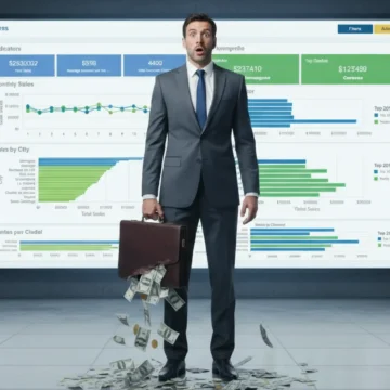
A CEO's true competitive advantage is not having data, but knowing what questions to ask it.
Experience guided business decisions for years.
In nearly all business applications—ERP, CRM, healthcare, or financial—users share one need
Developing software is an art. But one thing many teams underestimate reporting functionality.
Today, data-driven decision-making is no longer optional — it’s essential.
Have you ever delivered a report and been asked, “What does this mean for the business?”
In the era of Big Data, having information isn’t enough you need to communicate it clearly.
Today more than ever, leaders need clear answers—not more questions.
In sales, information is power—turn data into smart decisions and real results.
Imagine this: Your team opens a report and within seconds knows exactly what to do.
Have you ever felt that, despite having numerous reports and dashboards, something just doesn’t quite fit? You’re not alone.
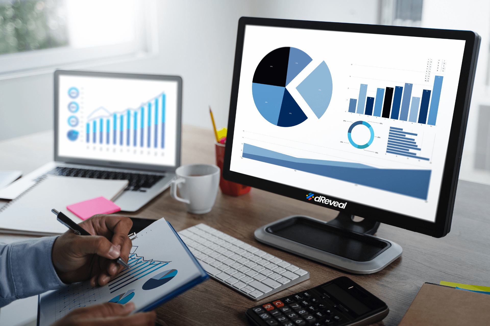
Data visualization is a powerful tool for communicating information clearly and effectively. However, not all charts are created equal.
You have an app that works, your users are using it, data is flowing.
Feeling overwhelmed, unsure how to start, and slightly fearful of the boss's potential reaction.
In the dynamic world of technology, effectively positioning yourself in the market can be a real challenge.
Imagine this: your users are engrossed in their workflow, analyzing data within your application.
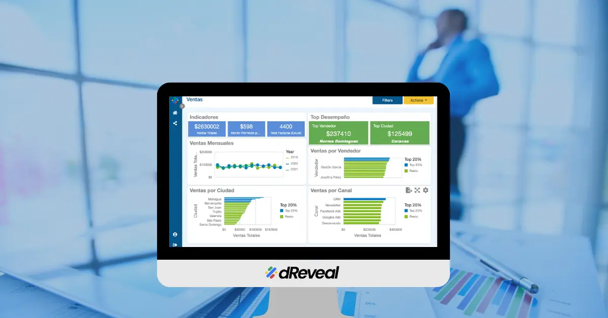
Incorporating a reporting tool is a smart decision for any business, and dReveal presents itself as the perfect solution.
In the fast-paced world of web applications, time is an invaluable asset.
In today's competitive business environment, standing out and making informed decisions are essential for success.
When it comes to data reporting, many companies might think that developing their own reporting tool is the way to go.
If you're looking for a simple way to obtain any report you need, dReveal is the perfect solution for you.
Ad hoc reports are vital for any business, providing key information and insights that drive decision-making and growth.
Incorporating dReveal into your operations without relying on your existing resources can dramatically improve your time to market,
Time to market is a critical factor for companies launching new software products or services.
There’s no way around the time and effort required to build features from scratch.
Developing robust software applications while juggling resources and market deadlines can be a challenge.