5 Ways to Optimize Your Dashboards for Faster Decision-Making (Without Wasting Time Filtering Data)

Today more than ever, leaders need clear answers—not more questions.
Yet many dashboards remain slow, confusing, or purely decorative.
Do you ever open a dashboard and not know where to start?
Do you spend more time trying to understand it than actually making decisions?
This isn’t always the team’s fault. Often, the problem lies in how dashboards are designed and structured—or in the tool itself, which no longer keeps up with the pace of the business.
In this article, I’ll share 5 practical ways to optimize your dashboards so they don’t just look good but deliver immediate clarity for decision-making and action.

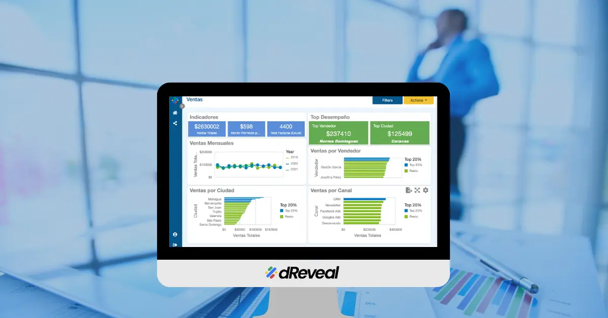
1. Show Only What Matters
A common mistake is overloading dashboards with metrics “just in case.”
But when everything is important, nothing is truly clear.
Real-life example:
A sales team reviewed over 15 metrics, but only 3 were critical for decisions. By streamlining and highlighting just those 3, they started making decisions in minutes—not hours.
Recommendation: Identify your essential KPIs and make them visible at a glance.
2. Filter Before Displaying: Don’t Load Unnecessary Data
A dashboard processing large volumes of real-time data can become slow or unreliable.
Practical example:
A company analyzed records dating back to 2016 every time the dashboard was opened. Result? Long load times and frequent errors. Solution? Display only the last 12 months by default. If users need more, they can request it.
Pro tip: Use preprocessed summaries, business rules for filtering, and scheduled data loads to reduce system strain.
3. Visualize Smartly, Not Excessively
More charts don’t mean more clarity.
A great dashboard should tell a story in seconds—no explanation needed.
What works:
- Large, visible KPIs
- Simple charts showing trends
- Intuitive color coding (green = good, red = alert)
What slows comprehension:
- Decorative but useless charts
- Illogical color schemes
- Duplicate visualizations
Current trend: AI-powered visualizations with automated explanations that interpret data for you.
4. Personalize the Experience by User
Showing all data to all users is like handing out a map without routes.
Your dashboards should adapt to the context of the user viewing them.
Example: An insurance company displayed the same information to everyone. By applying automatic filters based on user profile (region, channel, role), usage increased and errors decreased.
Tip: Create dynamic dashboards and segmented experiences for different roles.
Success story: A retail chain redesigned dashboards for field executives. Result? Fewer calls requesting reports and faster decisions from any point of sale.
5. Turn Dashboards into a Common Language for Teams
Dashboards shouldn’t just be clear to you—they should align your entire team without endless meetings.
How to achieve this:
Segment by role:
- Show the same metric with varying levels of detail (e.g., total sales for a director, sales by customer for an executive).
- Use guiding titles: “Executive View” vs. “Operational View.”
Add visual cues:
- Arrows or icons (→) indicating flows: “If Metric X drops, check Chart Y.”
- Clear legends: “Red = Off target | Green = On track.”
Real-world example:
A retailer eliminated 3 weekly meetings by standardizing dashboards with:
- Department-specific tabs (e.g., Finance vs. Sales).
- A global KPI visible to all (e.g., “Monthly goal: 80% achieved”).
- An automated email with the dashboard link and key questions: “Does anyone need to reprioritize?”
Key benefit: Less time explaining data + More time acting as a team.
Does Your Dashboard Help You Decide… or Just Show Data?
Dashboards should empower confident action—not create doubt.
If that’s not happening, you likely need a better way to visualize what matters.
Book a free strategy session to turn your dashboards into allies for agile decisions and clear goals.
Reserve your free session here
Recent Articles

Software Development: A Game-Changing Report Tool for BI Developers
February 17, 2023

How dReveal Can Help Improve Your Time to Market
June 13, 2023

Simplify Report Generation with dReveal
July 11, 2023


Keeping Users in the Flow: The Power of Embedded Reporting Tools
August 21, 2024


How to Choose the Best Visualization for Your Data
July 7, 2025


Why Your Application May Lose Users If You Don’t Embed Reports
August 22, 2025