How to Choose the Best Visualization for Your Data

In the era of Big Data, having information isn’t enough you need to communicate it clearly. A well-chosen data visualization helps uncover patterns, make smarter decisions, and convey findings without losing your audience.
But how do you know which type of chart is best for your data? In this article, you’ll learn when to use bar charts, line graphs, maps, or tables, with real-world examples and common pitfalls to avoid.
Why Is Choosing the Right Visualization Important?
Picking the wrong chart can lead to confusion, poor decisions, or even distrust in the data. An effective visualization:
- Highlights key insights.
- Avoids distorting information.
- Is quick to interpret.
- Adapts to the context and audience.
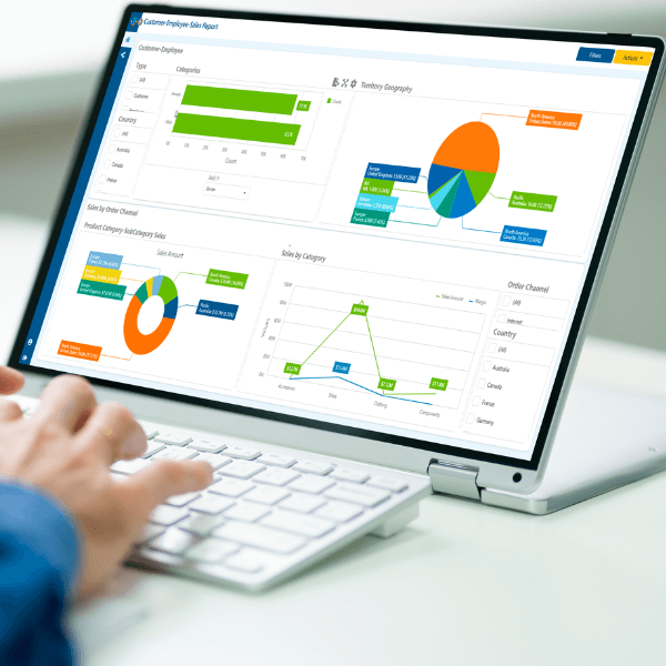
Types of Visualizations and When to Use Them

Bar Chart
Comparing Quantities
Ideal for: Comparing values across categories.
Best Practices:
- Use the same color for all bars (unless highlighting a specific item).
- Order bars to simplify comparisons.
Mistakes to Avoid:
- Too many categories (more than 10 can overwhelm).
- Rotated labels or 3D effects.
Line Graph
Showing Trends Over Time
Ideal for: Tracking how something changes over time.
Best Practices:
- Use smooth lines with distinct colors.
- Add markers if the dataset is small.
Mistakes to Avoid:
- Too many lines in a single chart.
- Unclear axes or unlabeled series.


Heatmaps and Geographic Maps:
Comparing Quantities
Displaying Spatial Data
Ideal for: Visualizing data distributed across regions.
Best Practices:
- Use logical color scales (low to high contrast).
- Display the legend clearly.
Mistakes to Avoid:
- Counterintuitive or oversaturated colors.
- Missing reference values.
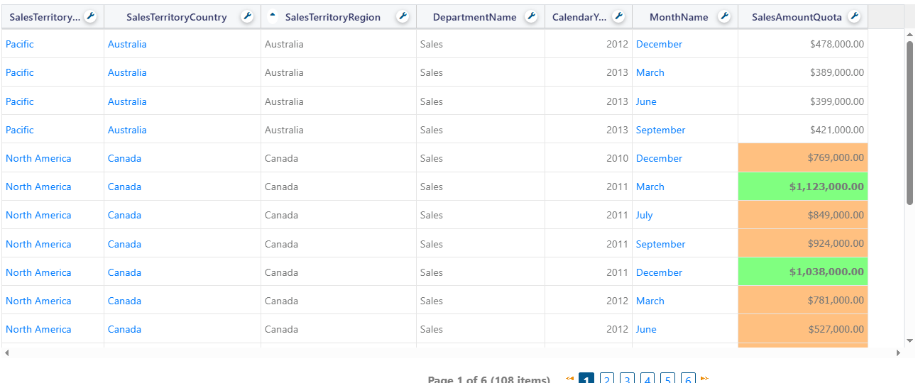
Tables
When Precision Matters
Ideal for: Presenting exact values for detailed review.
Best Practices:
- Limit visible rows and columns.
- Use conditional formatting to highlight key values.
Mistakes to Avoid:
- Overloading with too much data.
- Omitting filters or visual summaries.
Other Useful Charts
- Pie or Donut Chart: For simple percentages (best with fewer than 4 categories).
- Scatter Plot: For relationships between two variables (e.g., price vs. satisfaction).
- Funnel Chart: For sequential processes, like marketing conversions.
Mistake 1: Choosing a Chart Based Only on Aesthetics
Not all pretty charts are functional.
Mistake 2: Not Adapting to Your Audience
A CEO may need high-level trends, while an analyst craves detail.
Mistake 3: Overusing Color
Use cohesive, accessible palettes (consider color blindness).
Mistake 4: Lacking a Clear Message
Every chart should answer a question, not create more confusion.
The Right Visualization Turns Data into Decisions
Choosing the right chart is a critical skill for anyone working with data. A good visualization:
- Informs without confusing.
- Highlights what matters.
- Drives decision-making.
Before creating your next report or dashboard, ask yourself:
What do I want my audience to see or understand at a glance?

Recent Articles

Fewer Reports, More Impact
June 13, 2025