Reports with Purpose: How to Make Your Data Work for Your Business

Have you ever felt that, despite having numerous reports and dashboards, something just doesn’t quite fit? You’re not alone. Many leaders have access to valuable data but still make decisions based on intuition or incomplete information.
How Do You Know If Your Reports Could Be Better?
- Do your teams spend more time generating reports than using them to take action?
- Are your dashboards overly complex, requiring constant explanations?
- Do you feel like the data is there, but you struggle to turn it into agile decisions?
If any of this resonates with you, it’s not your team’s fault or a tooling issue—it’s simply a lack of alignment with what you truly need.
Small Changes, Big Results
Companies that successfully leverage their data usually focus on three key aspects:
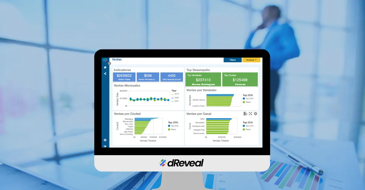
- Clarity on What Matters: Fewer charts, more actionable insights.
Example: Instead of displaying 10 sales metrics, highlight the 2-3 that need immediate attention. - User-Centric Design: Reports that answer concrete day-to-day questions.
Example: What does the sales team need to know every Monday? What should finance monitor before month-end closing? - Connection to Action: Don’t just show data—suggest next steps.
Example: If a KPI is out of range, the system could recommend reviewing X or adjusting Y.
The First Step Is the Most Important
This isn’t about a tech revolution—it’s about starting with small but meaningful changes.
Data only has value when it translates into clear decisions and concrete actions. Today, many companies navigate a sea of information without direction, missing opportunities by failing to use what they already have. The solution isn’t more reports—it’s purpose-driven reports: simple, relevant, and designed to drive action.
Small adjustments in approach can make a difference:
- Prioritize what matters.
- Adapt dashboards to your teams’ real needs.
- Link every data point to a next step.
The result? Less time interpreting charts and more time acting with confidence.
Your Next Step
Identify one report that currently generates more questions than answers and ask yourself:
“What decision should this facilitate?”
That’s your starting point.
What’s Your Biggest Challenge?
What’s the biggest hurdle you face in getting your team to use reports effectively?
Now, imagine this: In just two weeks, your teams could make faster, more confident decisions using the same data they already have.
Let’s make it happen—schedule a strategy session here.
Recent Articles
Software Development: A Game-Changing Report Tool for BI Developers
February 17, 2023

How dReveal Can Help Improve Your Time to Market
June 13, 2023

Simplify Report Generation with dReveal
July 11, 2023


Keeping Users in the Flow: The Power of Embedded Reporting Tools
August 21, 2024


How to Choose the Best Visualization for Your Data
July 7, 2025


Why Your Application May Lose Users If You Don’t Embed Reports
August 22, 2025